logos
DESIGN BY HANI LTD
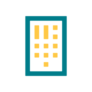
This logo is for my own website, desognbyhani.com, which is currently being built. I will showcase all of my design and creative work on this website. My main objective for this logo was to combine my love for Arabic Kufic calligraphy, abstract art, history and the colours yellow and green and use these to design a modern type logo for myself.
Arabic Kufic Calligraphy – The block style of the logo covers this.
History – I used morse code. Each vertical dash and dot combination spell out the letters D B H. D = dash dot dot, B = dash, dot, dot, dot, and H = dot, dot, dot, dot.
FINDING FAITH
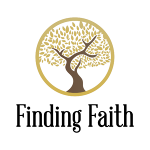
Finding Faith is an Edinburgh based initiative. It’s a support system for new Muslims or for anyone wanting to find out more about the religion of Islam.
The main brief for this logo was illustrate growth, prestige and trust.
REVIVING SOULS
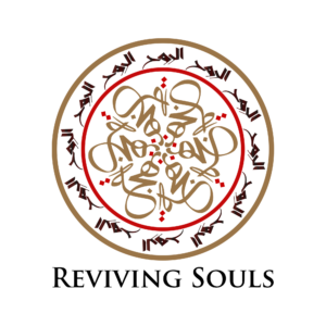
Reviving Souls is an Islamic Education Institute based in Edinburgh. The main brief that was provided for this logo was to incorporate the Arabic words, Bahjatu al-Ruh, which translates to Reviving Souls. The other important aspect of this logo was to have symmetry, and red and gold.
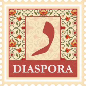
DIASPORA
This logo was designed for a start-up. The objectives that were provided were to make it look like a stamp and give it that asian sub-continent feel. The company are set to provide products from Pakistan.
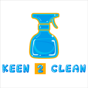
KEEN 2 CLEAN
This company is based in Glasgow. They provide cleaning services to Mosques, residential properties and deep cleaning of streets and alleys in and around Glasgow.
The main objective for this logo was to involve a cleaning product and give it a bougie style. In the end all of the bougie logo designs were rejected and the director of the company wanted me to make use of my artistic skills to come up with a logo that “pops out” more.
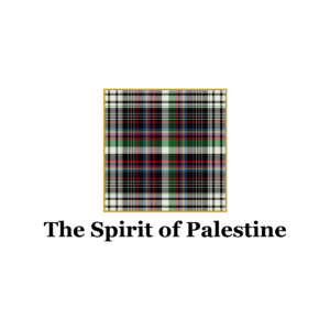
SPIRIT OF PALESTINE
Spirit of Palestine is an organisation which has worked with tartan-makers in Scotland to come up with a Palestinian tartan. The logo for this was fairly simple. Use the tartan as the centre-piece of the logo.
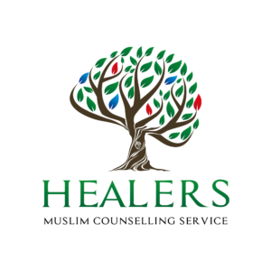
HEALERS MUSLIM COUNSELLING SERVICES
The brief for this logo were to somehow connect the following words: growth, mental health, heart health, mind health, healing, and progression. This is where I came up with the name Healers and I had already had it in my mind that I wanted to design a tree where the leaves looked like a brain and in the trunk of the tree, was the symbol of an actual heart.
The green represents Islam and healing, the blue represents progress and the red represents trauma.
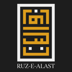
RUZ-E-ALAST
This logo was designed for a teacher of mine for his blog site. Ruz-e-Alast translates to “The Day of “Am I not your Lord?”. This is in connection with the verse in the Qur’an, where God asked “Am I not your Lord?” to all the souls and every soul replied back “Of course, we testify.”
I was given creative freedom with this logo and there was no brief provided. So, I used Kufic Arabic to come up with this design.
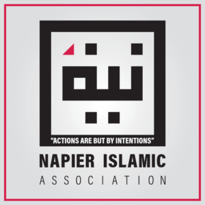
NAPIER ISLAMIC ASSOCIATION
As an alumni of Napier University in Edinburgh, I was approached by the association to design a logo for their revived Islamic Society. They didn’t have much of a brief for me as they were all year one students.
In my own brainstorming procedure, I realised that the initials, NIA, also translated to a word in arabic, niyah. Niyah means intentions and one of Islamic core beliefs is that all of our actions are based on the intentions behind the actions.